When Too Many Colours Speak at Once
Mood: Flustered but Functional | Post Type: Work Spotlight | Weeks Until Show: 47
When the Inner Critic Won’t Shut Up
My inner critic has been far too loud lately — they’re an absolute so-and-so (and yes, I usually use more colourful language!). I know I shouldn’t listen, but right now it’s wearing its “overwhelm” hat, with a “guilt” hat stacked right on top. Why? Because I promised myself I’d have all my pieces planned and sketched by the end of September… and here we are, and it just hasn’t happened.
I’ve never created a full collection before, and part of me sometimes wishes it were as simple as putting paint on canvas. (Not that painting is easy — I know painters wrestle with colour theory, composition, and skill.) But with glass, everything feels more complicated. Each layer is definitive, with no way to undo or tweak once it’s in place — and lately, that’s turned into a real fear of even starting.
So, I went back to basics and pulled out my paints. Over the past year I’ve dabbled in acrylics, water-soluble wax pastels, and watercolour brush pens — all with the aim of designing my glass pieces on paper first. Because every layer in glass has to be thought through, I hoped these tools would let me test ideas and have a little more control over the outcome.
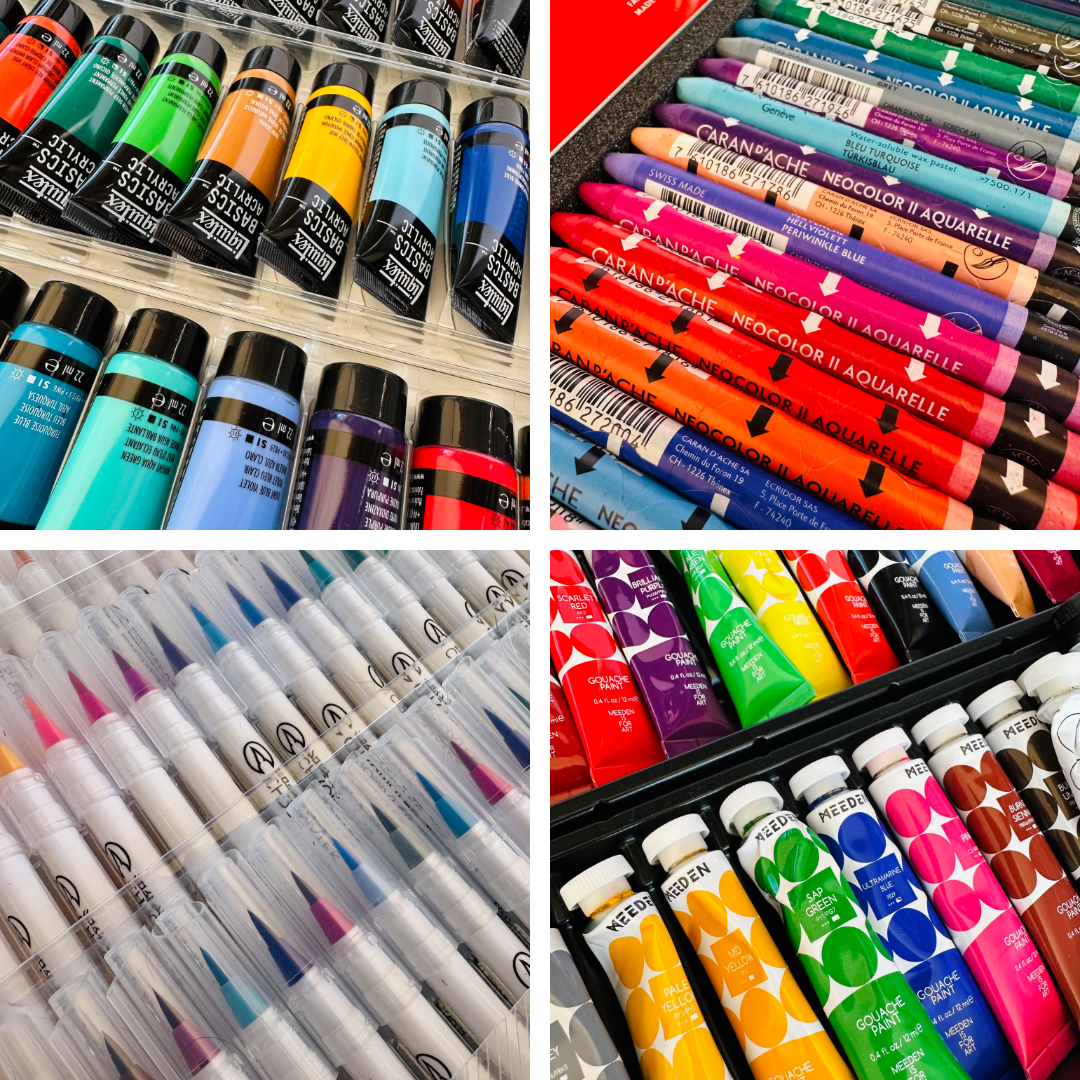
Acrylics | Soluble Wax Pastels | Watercolour Brush Pens | Gouache
Trying Every Medium Under the Sun
Acrylics, though, dry far too quickly and are so opaque they look nothing like glass. I love my water-soluble wax pastels, but they’re not the easiest for colour mixing — they need so much water that the colours end up weak and transparent (though they do make a brilliant travel companion). My most recent experiment was with watercolour brush pens: I started with a basic set, then invested in a larger one from another brand… and just didn’t get on with them. They’re back in the drawer for now — but I’ve learned not to feel guilty about these purchases. Sooner or later, I always find a use for materials or equipment that didn’t quite fit at the time.
And so I returned to my gouache set (pronounced gwash). It’s a cheap beginner’s kit, but it does the job. Instead of forcing myself to design whole pieces, I gave myself permission just to play — and started making colour swatches.
I played with the four colours I’d chosen — yellow ochre, brilliant purple, cerulean blue, and sap green — mixing them with white and a dark grey to create different shades and tones. Painters would normally use black, but I’ve had to compromise — glass is made of particles, so it doesn’t blend in the same way as pigment. I also mixed the colours together, then added white and grey again. Before long, I’d created well over 100 colour swatches, all harmonising beautifully — and now came the challenge of narrowing them down.
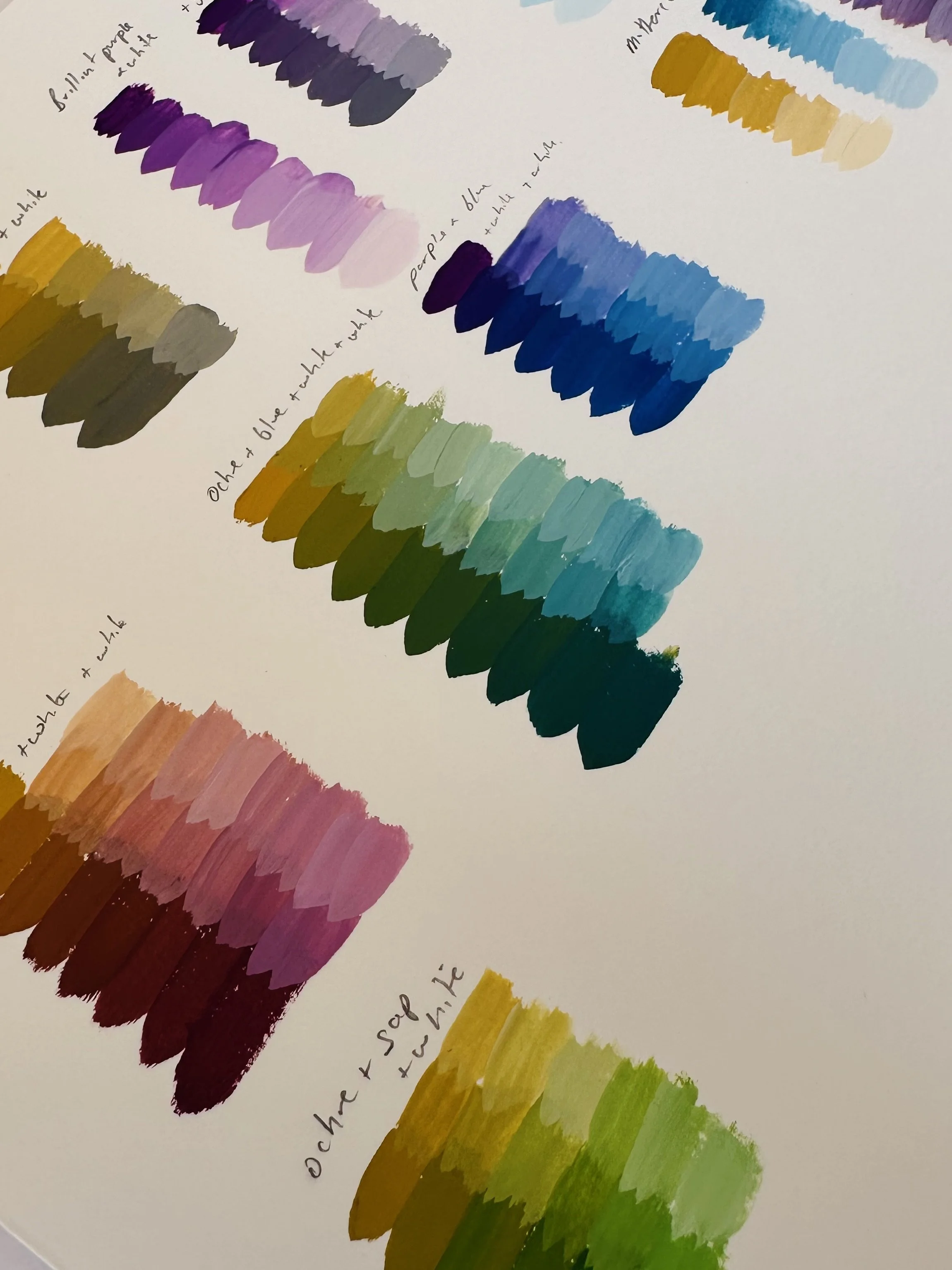
Colour mixing…
Six for the Sky, Six for the Ground
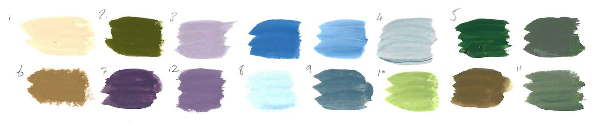
Once I had 16 colours I felt happy with, I narrowed them down to 12 — six for the ground and six for the sky. To make sure I had a real spread of values (darks, mids, lights), I scanned my swatches and converted them to black and white. It’s surprising how many “light” colours actually fall into the mid-range when you strip the hue (colour) away.
The downside of gouache (gwash) is its matte, chalky finish. Trying to match swatches with my glossy glass samples was that little bit more trickier, so I resorted to using clear nail varnish. I’m no girly girl — the only nail varnish I own is clear! It worked well enough to add a bit of shine, but it’s not a long-term solution (it’ll probably yellow in time). I’ll invest in a small bottle of gloss medium soon, but for now the extra sheen did the job.
Translating Paint into Glass
With my 12 colours chosen, the next step was to recreate them in glass powders (crushed coloured glass). To emulate the swatches, I’ve mixed some colours directly with each other, muted others with transparent grey, and even started experimenting with adding crystal clear powder to soften the darker tones and heavy opaques.
They’re all experiments — and the truth is, I won’t know how close I’ve come until after firing. Each cycle takes a full 24 hours before I can open the kiln, so there’s no instant feedback, only patience and curiosity.
So far, around six of the swatches matched quite well in colour, but not always in value. Value simply means how light or dark a colour appears — its place on a scale from white to black. It matters because value is what gives a landscape depth and form. If two colours are different in hue (colour) but very similar in value, they can blur together; if their values contrast, the design becomes clearer and more dynamic.
Working with both opaque and transparent glasses makes this even trickier. I’m learning opaques tend to hold their value consistently, but transparents shift depending on how light passes through, how thick the layering of powder is, and what’s behind them. That means even if the hue looks right, the value might not line up with my painted swatches.
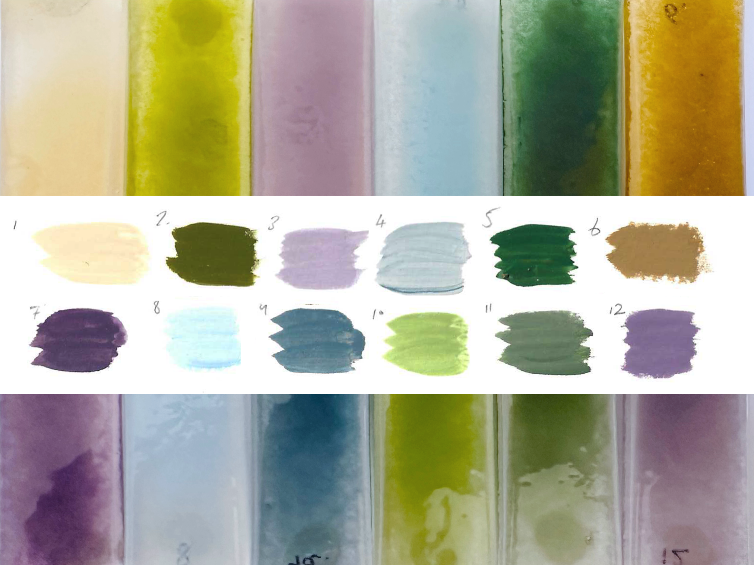
Gouache swatches and the glass colour samples
From reviewing each test, I’ve now created a further 16 glass powder mixes to try. My sample sheets are multiplying quickly, so I’ve started a digital running list of all the mixes — partly to avoid duplicating recipes, but also to track which ones succeed in both colour and value. Even though my paint swatch to glass sample experiment wasn’t exactly a roaring success, the learning has been invaluable. Each round brings me a step closer to shaping a process I can rely on when designing larger, more intentional pieces.
I also realise I only have one set of swatches, and not all 16 pieces in the show can share the same palette — otherwise it would just look like a “summer collection.” But it’s a start. Inspired by a recent drive across Dartmoor (we tend to hike the moors between October and March, to avoid the ticks, adders, and tourists), I’m was reminded how much the moor changes with light and season, and how much that fed into my colour selection.
It’s also a good reminder that overwhelm can shift into play, and this play can become the foundation for designing my larger, more intentional pieces. And of course, nothing sharpens focus quite like a deadline. I need two 10×8 pieces ready for an exhibition in January — photographed by 5th December to make the catalogue. That date is coming fast, but maybe it’s exactly the push I need.