
Four Ways to Build a Landscape
Mood: Patiently Determined | Post Type: Work Spotlight | Weeks Until Show: 39
The Tug-of-War Between Precision and Creativity
I find myself sometimes being very literal with the larger landscapes. With my pendants, though, the process is far more intuitive. Over time, I’ve built up a kind of library of pre-designed glass sheets — each one a small experiment in colour, texture, and transparency. When I start a pendant, I’ll choose a base and then pick from this growing collection to build the four layers. I have a rough sense of what I want to achieve, but much of it is discovered in the moment. Because there’s still so much unpredictability in how the layers will fuse, I document each one before firing — it’s a way of capturing that stage of the process before it transforms completely. That uncertainty is what I love most; it feels more like play than precision.

Documenting in my sketchbooks
Four Possible Paths (None of Them Perfect)
Working on the larger landscapes feels like a whole different challenge. The scale brings extra cost, which means I can’t afford as much trial and error, and there’s simply less room for waste. But it also opens up space for more detail — and that’s both exciting and daunting at times. I’m still finding my way with them (and yes, I know the clock’s ticking). So far, I’ve tried four different approaches:
Creating larger pre-designed sheets – similar to the ones I make for pendants, allowing me to “plug and play” on a bigger scale.
Scaling up from successful pendants – using the documented four separate layers as a foundation for a larger landscape.
Designing each individual layer from a photograph – translating real imagery into layered glass form.
Designing each individual layer from a sketch – working from drawn ideas to guide the composition.
Four Possible Paths (None of Them Perfect)
I’ve now had a go at all of these approaches — to varying degrees — and here’s what I’ve learned.
Making Larger Pre-Designed Sheets
I tried this early on, when my “larger” landscapes were still only around 7 x 5 cm. It was feasible then because my pre-designed sheets are usually slightly bigger — a sky might be 8 x 6 cm, leaving plenty to work with.
However, I quickly realised that the abstract quality of my pendants comes from only using a tiny 2 x 2 cm section of a sheet — a cropped moment of colour and movement. When I began using larger areas, that abstraction disappeared, and the work lost some of its spontaneity and charm.
I also tried scaling up pendant-style designs into bigger, purpose-made sheets, but unless I used them exactly as planned, they often felt redundant — and that kind of waste doesn’t sit well with me.
5/10
If I had to score the success of this approach, it would be a 5 out of 10 — interesting in theory, but it lost some of the spontaneity that makes my pendants sing.
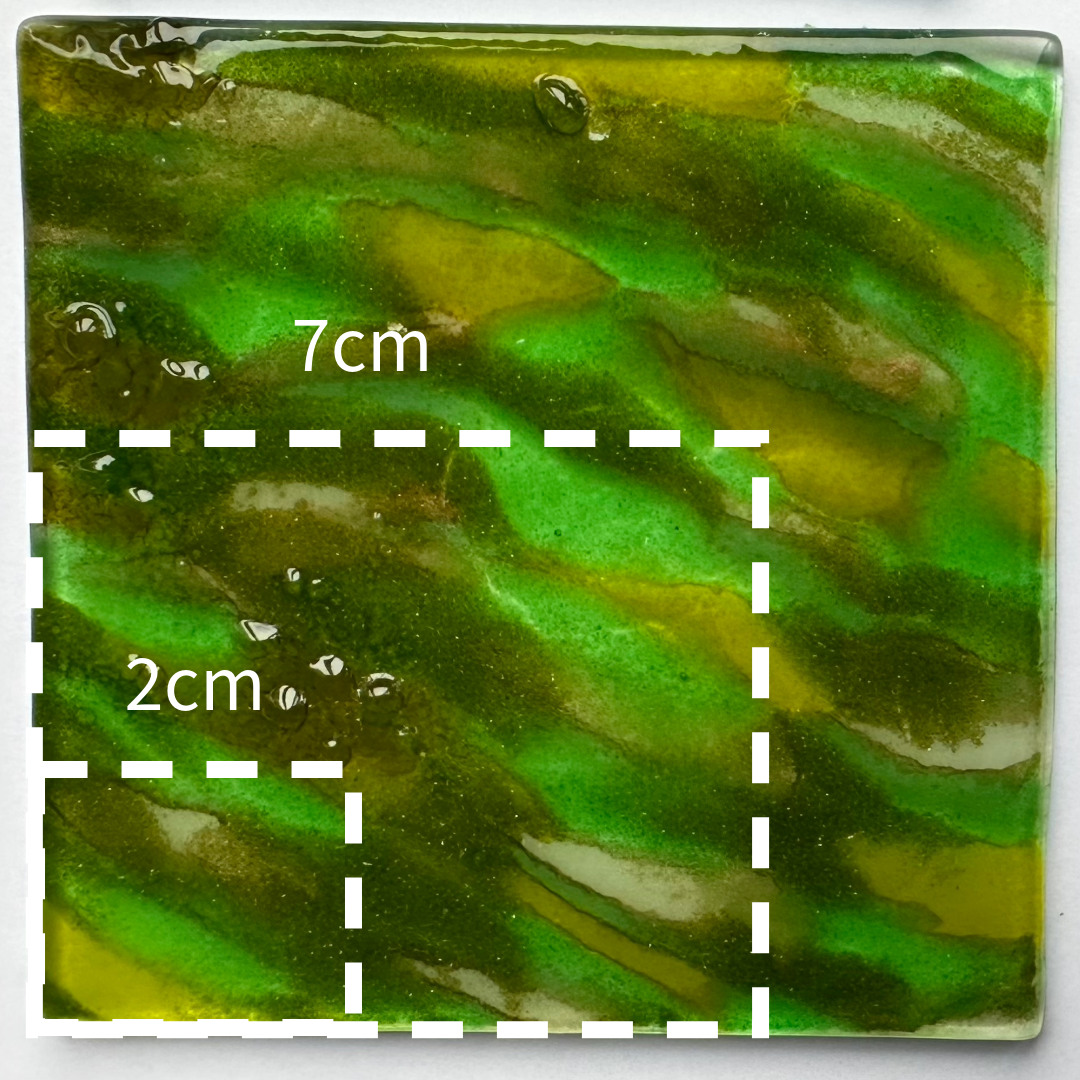
Showing how a single sheet behaves differently when used for a pendant versus a larger artwork, and how enlarging the area can diminish the intimate, abstract quality that emerges in smaller sections.
Scaling Up from Successful Pendants
This is an approach I first tried a while back and revisited again recently. I take the four documented layers from a pendant and recreate them on a larger scale. The first piece wasn’t entirely successful — but it wasn’t a failure either. The challenges came from elements I’d added that weren’t part of the original design: experiments with gold mica that proved unforgiving, and the inclusion of two Dartmoor ponies taken from photographs. Once scaled up, the ponies had almost vanished into the landscape — and the little that remained had stretched so much they looked more like Highland cows.
It was this experience that set me on a new line of inquiry: how do the four layers behave when scaled up, and can I anticipate or compensate for that distortion? After experimenting with grids and measurements, I tried replicating one of my coastal pendants, Siren’s Call. This time I approached it with more design and consideration, rather than a direct copy — and I’m genuinely pleased with the result.
8/10
If I were scoring this one, I’d give it an 8 out of 10 — a strong foundation with plenty of room to grow.


Designing Each Layer from a Photograph
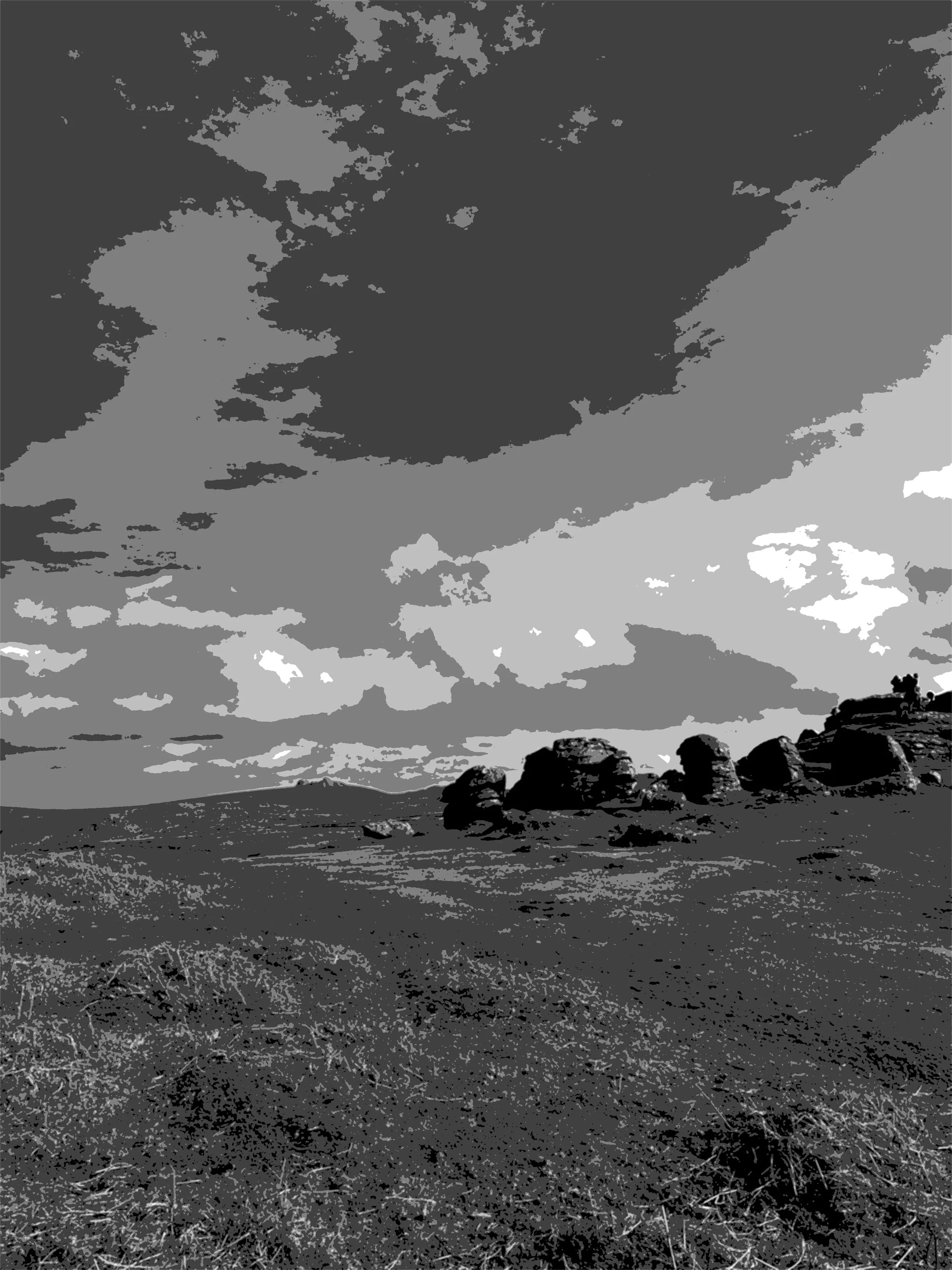
Working from a reference photograph has its advantages. Having a visual image helps me see how a landscape might naturally separate into four layers — foreground, middle ground, distance, and sky — and how those can be built in glass. I also use software to analyse the value structure, identifying where the darks and lights fall, which helps with planning.
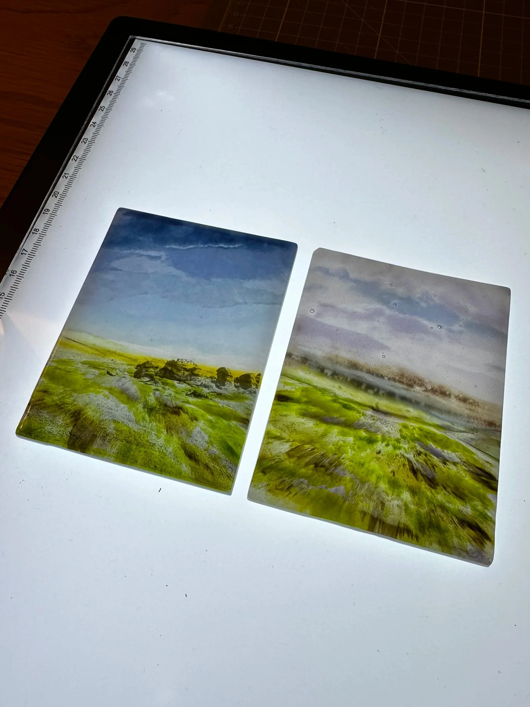
This approach worked well for designing each layer, and I was able to complete the piece using the photograph of Honeybag Tor. It also served as another reminder of how the layers stretch once fused. My beautiful sunrise slipped just out of frame during firing — a disappointing discovery, but a useful reinforcement that I need to design with that stretch in mind. Apart from my disappearing sun, the piece came together well and gave me valuable insight into how photographic detail translates through glass.
8.5/10
If I were to score this approach, it would be an 8.5 out of 10 — apart from my disappearing sunrise, it worked beautifully and taught me a lot.
Designing Each Layer from a Sketch
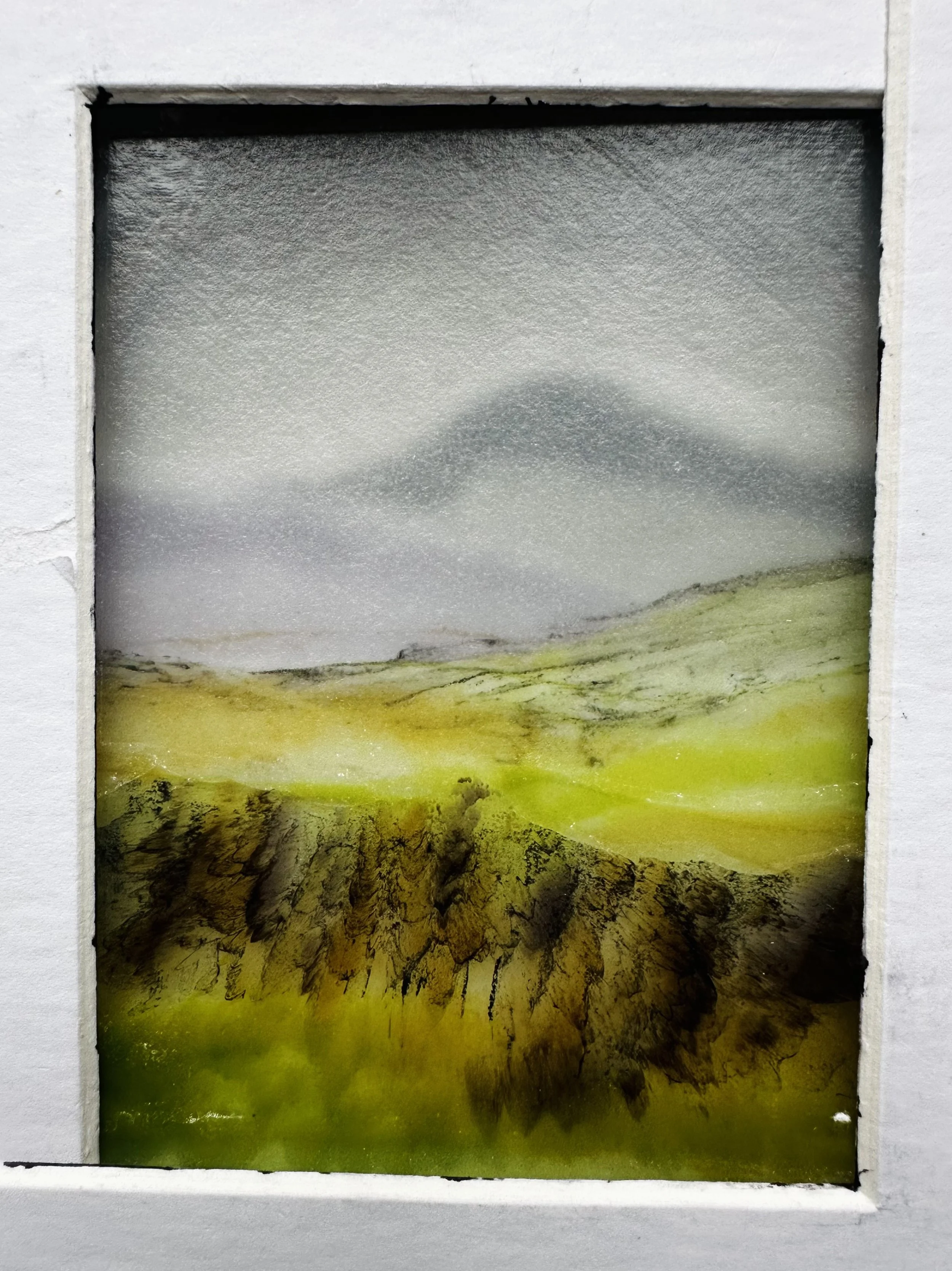
This approach came from a thumbnail sketch I made during our Dartmoor sketching session. Reflecting on it now, I think I was probably trying to run before I could walk — but, as with all of these experiments, there were lessons to be learned. At the time, I think I got caught up in the idea that if I could take a sketch and turn it into a glass masterpiece, then I’d somehow crossed the line from “wannabe” to “bonafide artist.”
Once I set that mindset aside, I focused on designing the four layers. The results, however, were mixed. The background moors turned out quite blocky, lacking the subtle gradation that naturally appears in my pre-designed sheets — something I still find curiously fascinating. This piece also suffered from a lack of light consideration; because I was working from such a small thumbnail, I hadn’t really mapped where the light and shadow fell across the landscape. It was a humbling reminder that even a simple sketch needs clarity and depth before it can translate successfully into glass.
6/10
If I’m being honest, this one’s a 6 out of 10 — a valuable learning curve, but definitely a case of trying to run before I could walk.

Closing Reflection
Writing this blog has allowed me to step back and really consider the four approaches — what’s working well now, and where I can grow as an artist. Combining different layers from my pendants has proved to be a fantastic test bed, and I can already see how elements from these smaller experiments can be incorporated into my larger landscapes. There will also be those rare pendants, like Siren’s Call, where every inch feels worth recreating on a grander scale.
Looking at reference photos in black and white has also earned its place in my process; it gives me a quick snapshot of light and dark areas and helps me plan more effectively. I’m not ruling out sketches completely, but I know I need to develop my ability to capture light better before they can truly stand in for a reference photo.
So, for my next larger landscape, I’m going to use a photograph from our recent hike and weave in some pendant-inspired layers. I can already picture a salmon-pink horizon fading into a soft grey glow. Now I just need to work out the ground element — wish me luck!
This is Episode 11 in my ‘Solo Show Diary’ series — a behind-the-scenes look at how my work develops. You can find my earlier posts here.