
Creative Intent: The Card Deck
Mood: Woefully Hopeful | Post Type: Work Spotlight | Weeks Until Show: 37
The Price of Taking Shortcuts
With the Christmas events behind me, the galleries stocked, and my website updated, I’m hoping that over the festive break I can really sink my teeth into scaling up and designing each of the larger layers with intent. I’m also very aware of where my lack of patience tends to show itself.
I keep reaching for the original glass powder colours instead of using the nuanced ones I’ve spent months developing. I can feel myself slipping back into that too-literal trap out of laziness, even though I have a frankly ridiculous number of samples—greys of every persuasion: purple greys, blue greys, yellow greys—all perfect for distant hills.
Yet in my last (and unsuccessful) larger landscape, I defaulted to the original glass colours and paid the price. After all, I am essentially painting in glass—and no painter would ever squeeze colour straight from the tube without mixing it first. It’s exactly the same principle here. That realisation led me to a new idea—one I haven’t fully put into action yet, but one that I think has real potential, perhaps not just for me. Stick with me!
The Card Deck That Took On a Life of Its Own
I’ve been developing a card deck for a while. It started as a bright idea and then very quickly tipped into ADHD hyper-focus. Thank goodness for my day job, because I truly went down a rabbit hole where the necessity for eating and peeing might have completely evaporated (excuse the pun). After 20+ different versions, I’m finally happy with the words on the cards. Now I’m trying to design the actual deck, and of course I’ve lost momentum — so I’m hoping this blog will nudge me into finishing it.
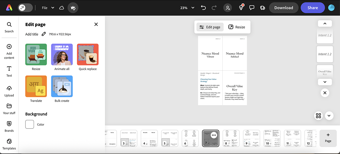
Attempting to create my card deck
Intent, Structure, Colour — The Big Three
There are three main categories: Intent, Structural Design, and Colour Design. I realise these could easily lead me into deeper, more complicated waters, and I won’t truly know until I try the full set. But even the first category alone should help shift some of my current pitfalls.
The Intent is about designing the mood of the piece — specifically the anchor mood that sets the emotional foundation. It’s the overall atmosphere or energy I want the viewer to feel. This choice shapes everything that follows, from value and composition to light and colour. It’s a bit like choosing the genre of a film before setting the scene. However, the first step is to convert my reference image to black and white.
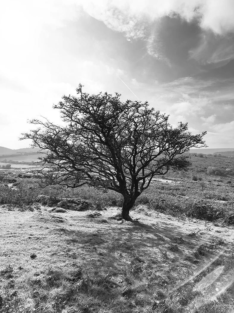
So I’ll begin with a reference photo; that way, the colour won’t distract me from the underlying structure.
Seeing the Structure Behind the Colour
The reference photo is also a useful way to understand the value of a scene. When I say “value” in art terms, I’m referring to the contrast between light and dark—the element that actually makes an image work, more than colour ever will. Every colour has a value. For example, a deep purple would sit on the darker end of a value scale of 1 to 10, while a pale blue would fall closer to the light end. And it’s not always straightforward.
A great way to see this in action is to take a photo and remove all the saturation. Once the colour disappears, the true structure is revealed. As they say, “value does the hard work, and colour takes the glory.”
I recently heard on a creative podcast that you can usually tell—95% of the time—whether the values work simply by looking at a thumbnail of an image. If it doesn’t read clearly at that small scale, enlarging it won’t fix the issue.
Setting the Emotional Foundation
So the first step is to choose an ‘Anchor Mood’ to set the emotional foundation—the overall atmosphere or energy of the piece. It should capture the feeling you want the viewer to experience, and this choice shapes every later decision—from value and composition through to light and colour. Think of it like choosing the genre of a film before setting the scene. I have six anchor words to choose from: serene, wistful, atmospheric, dramatic, vibrant, and subdued. I already have my own thoughts for the reference photo above, but before I share them, which Anchor Mood would you choose, and which one feels like the best fit?
Serene | Wistful | Atmospheric | Dramatic | Vibrant | Subdued
Hopefully you’ve now chosen your core mood. Next comes the mood shading—the nuance that adds flavour and depth to your anchor choice. For example, if your anchor mood is ‘dramatic’, its mood shading might be stormy, dynamic, or explosive. Each anchor has ten related descriptive words to help fine-tune the emotion. Take a look at the words below and choose one or two from your anchor’s family to capture the specific tone or atmosphere you want to convey.
Serene - tranquil | gentle | balanced | harmonious | soothing | still | graceful | restful | meditative | quiet
Wistful – nostalgic | reflective | tender | longing | bittersweet | pensive | dreamy | yearning | gentle sadness | sentimental
Atmospheric – moody | immersive | layered | mysterious | expansive | veiled | dimensional | ethereal | shadowed | ambient
Dramatic - intense | stormy | bold | theatrical | forceful | commanding | explosive | dynamic | fierce | urgent
Vibrant – radiant | lively | spirited | flourishing | colourful | bright | dynamic | energetic | animated | festive
Subdued – muted | restrained | hushed | understated | softened | shadowy | low-key | faded | toned-down | delicate
So what did you come up with?
My choice was Atmospheric: Moody & Mysterious. I thought it might be fun to ask Chatty G (ChatGPT), and it came back with something quite different: Wistful: Pensive & Dreamy.
Maybe Progress… Maybe Another Distraction
The next step is technically structural design, but I may skip ahead to colour design to explore how I can create something moody and mysterious. I think that will help me move away from my earlier habit of being too literal, and instead lean into artistic intention and more deliberate choices. Only time will tell whether I’m onto something—or whether this will simply become another distraction. Watch this space!
This is Episode 11 in my ‘Solo Show Diary’ series — a behind-the-scenes look at how my work develops. You can find my earlier posts here.